A Hat in Time
Project type: Kickstarter campaign
Made: June 2013
My fields: Kickstarter and PR promoter, Community Manager
Time spent on this project: 30 days (+ a few weeks of preparing)
Tools used: Google Docs, Podio, Gmail, Photoshop, Sony Vegas Pro
DOWNLOAD:
A Hat in Time
About this project:
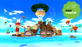
A Hat in Time is a 3D collect-a-thon platformer in the spirit of the classic Nintendo 64 titles you know and love!
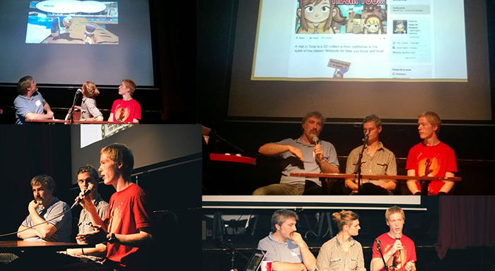
UPDATE: In September 2013, I participated in a panel debate about Kickstarter projects
During the kickoff event of the Bermuda initiative at Platform4, I was invited to a panel debate about Danish Kickstarter projects.
Together with Thomas Lund (Jagged Alliance: Flashback) and Mikkel Mainz (The Reward – Tales of Alethrion), we had an open discussion about how to make a good Kickstarter campaign. All three projects were very different from each other, which made it particular interesting to share our experiences with one another.
In June 2013, I helped my friend Jonas Kærlev make and maintain a Kickstarter campaign for a game called A Hat in Time. I did not work directly on the game itself, but I was one of the main responsible for the Kickstarter campaign, its structure and the video created to promote the game.
A Hat in Time is being developed by Gears for Breakfast, which was created by Jonas Kærlev in 2012, and consists of eight developers from all over the world. The game is being developed in UDK and is planned to be released early 2014 for PC and Mac, as well as Wii U and other consoles, if a publisher deal can be made.
It was my job to create as much buzz around the game and its Kickstarter campaign as possible. I contacted a wide range of game websites and forums, writing individual press releases and posts. However, it should be noted that the game already had a decent following before the Kickstarter campaign began. That being said, a lot of work was put behind the actual campaign to make it look as interesting and smooth as possible (i.e. reduce unnecessary clutter and make everything easy to read and understand).
The campaign’s funding period ran from May 29, 2013 to Jun 28, 2013 (30 days). The initial goal was to get $30,000. However, this goal was met within 24 hours, but fortunately a set of stretch goals were prepared. The final pledge amount ended up being $296,360 with 9,169 backers.
Before the campaign started, I carefully researched and analyzed similar Kickstarter campaigns. I looked at how much money they asked for; the description text and use of images and videos; how many and what kinds of pledge rewards were used; how the campaign video was structured; how to keep contact with the community – and more. Meanwhile, I gathered a lot of tips and tricks from various websites and friends I knew, resulting in the following Kickstarter page (click on the thumbnail to see the whole image):

(To see how the Kickstarter campaign looked when it was completed, click the “DOWNLOAD” link in the top)
Among others, one of the most useful tips I used were to have animated GIFs. Since GIFs don’t require the viewer to manually click “play” like in a video, they are very good to quickly showcase the game and ignite an immediate interest. GIFs are more “in-your-face” than a video, and they are also very easy to share and spread, e.g. via forums such as NeoGAF (I engaged with the community at NeoGAF, answering questions about the game and the Kickstarter campaign). The only problem with GIFs are the file sizes. A small video clip can easily be 10-20 MB large each. This means that one should avoid displaying too many GIFs at once, since they will often lag or not even play in the web browser (if this is the case on this portfolio site, try reloading the page).


Another trick I learned came from the hugely-successful Pebble E-Paper Watch. The idea is simply to have a small image in the top of the campaign description asking the user to please watch the movie. This has a psychological effect of call to action. Even though it seems primitive, it might help improving the chances of getting the viewer to click and watch the video. In the end, this hopefully increases the viewer’s interest in the project, so the person wants to support it by making a pledge. Speaking of the Kickstarter video itself, I helped Jonas deciding what should be said and how long the video should be. One important aspect was to showcase the game as early as possible in the video, to catch the viewer’s attention.

I also went to SpilBar 15 in Copenhagen to showcase the game. A small video was produced from the event which can be watched below.
The following is a short selection of websites that wrote about the Kickstarter campaign
- Rock Paper Shotgun
- Kotaku
- Polygon
- Joystiq
- Nintendo Life
- Go Nintendo
- VG247
- Gamnesia
- NeoGAF
- Polycount
- 3D Buzz
- Spiludvikling
- N-club
- IGN Danmark
- Eurogamer Danmark


